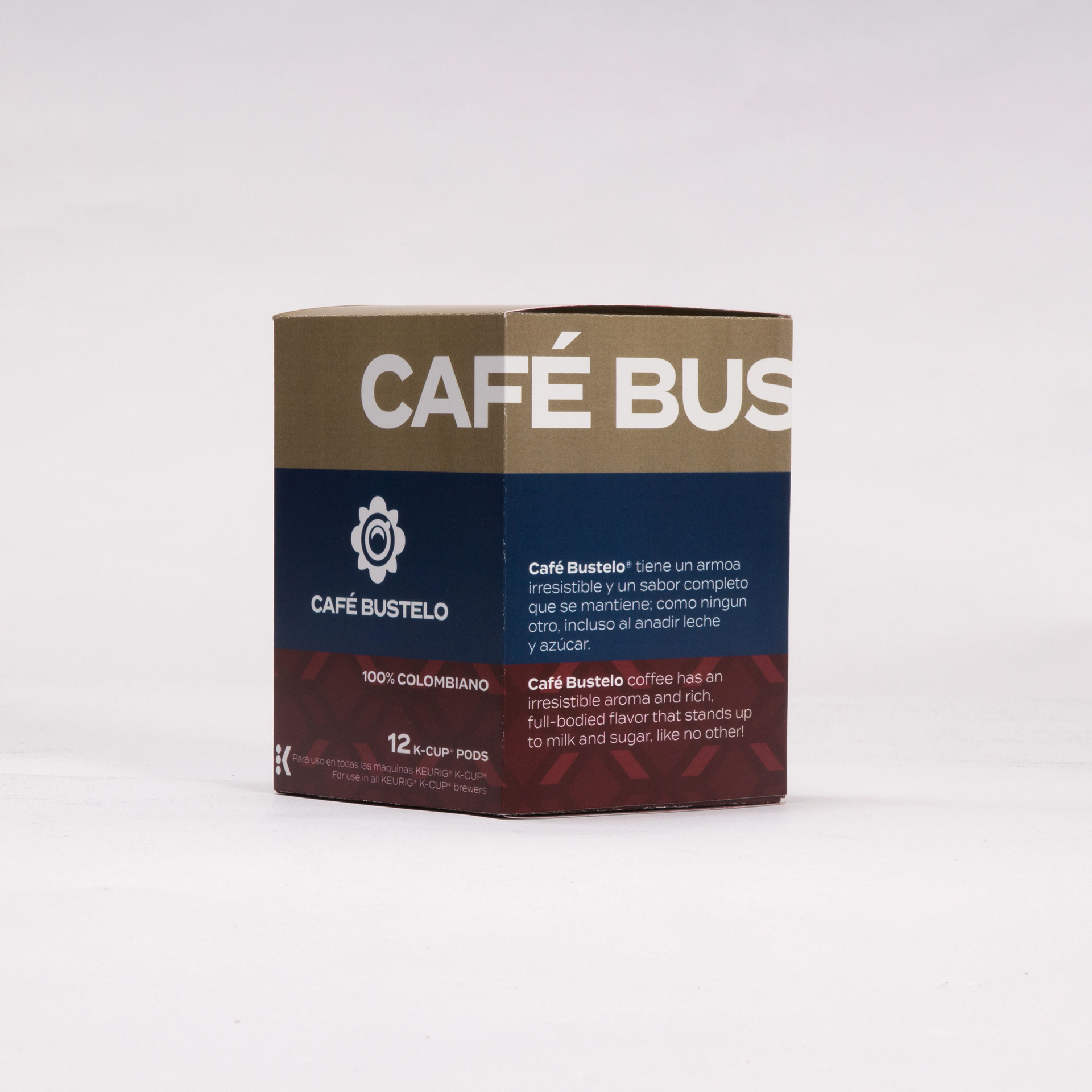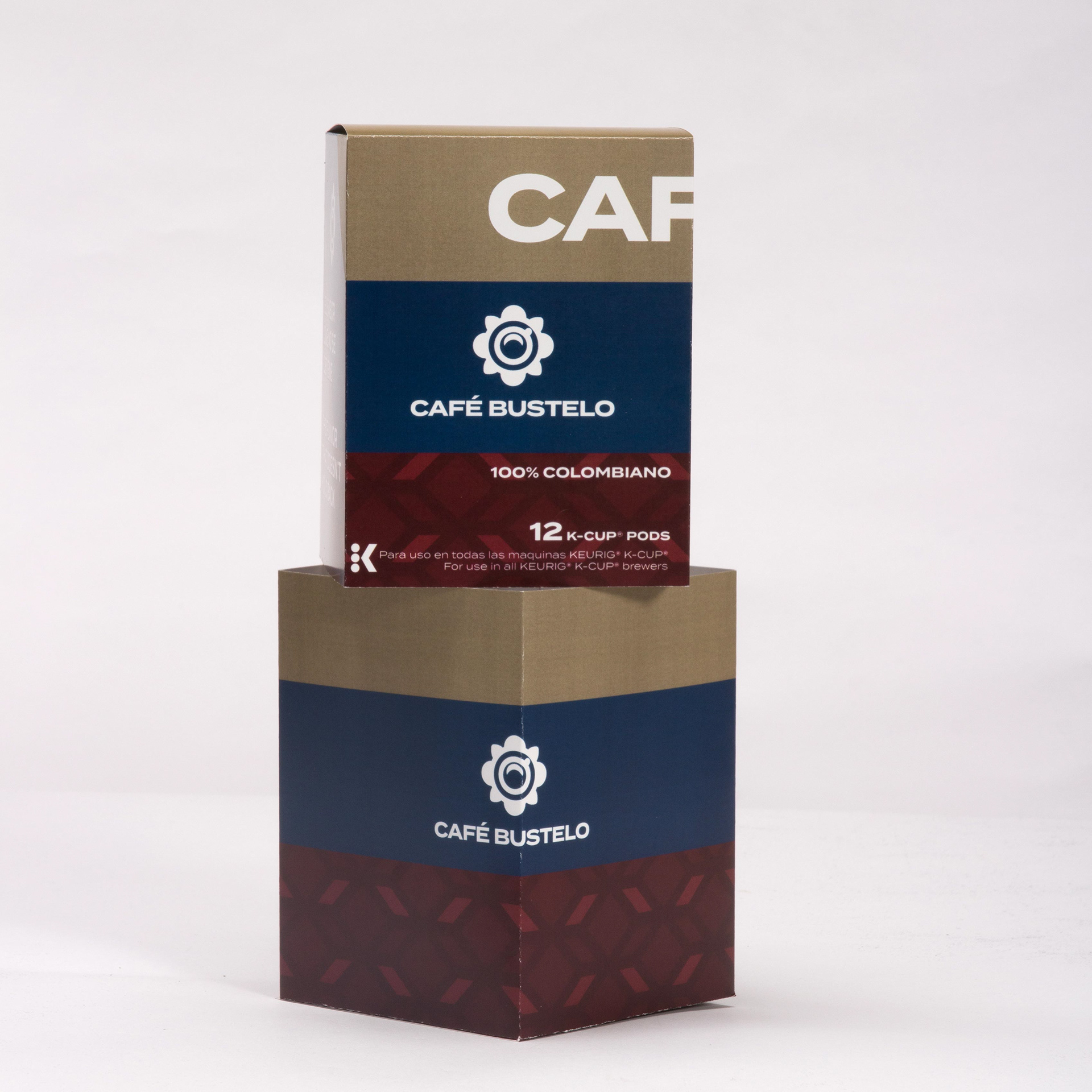
I chose one of Cafe Bustelo's Keurig Cup packaging designs. The original package does not appeal to me, but with a name like Cafe Bustelo, it will complement a sophisticated design.
I was inspired by high-end apparel labels that used a broad sans serif typeface, an imbalanced design language, and made good use of available space. I wanted to preserve the Colombian motif, so I utilized the same colors as the Colombian flag but toned them down to give it a rich sense.
The logo is based on a pattern I discovered on one of their other products. It obviously needs to be viewed more than once to realize that it is a coffee cup that doubles as a flower, so I felt it went well.