
Another school project is designing a take-out box and bag for a fictional or non-fictional restaurant. I picked the fictional road and made Chibog.120. A Filipino restaurant that specialized in Filipino desserts, notably Halo-Halo, after which the logo was made. I chose to create a fictional Filipino restaurant because there aren't many of them in Minnesota, so I figured it would be fun to make one up myself. The name is derived from the slang term "Chibog," which means "let's eat," and "120," which is the latitude coordinate of Manila, the Philippines' capital.
The general design language leans more toward a Western style than a conventional stereotypical Filipino style in order to attract more people because it is more familiar. I chose to keep it basic because the name, logo, and restaurant itself are already unique, and I didn't want anything extra to detract from that.


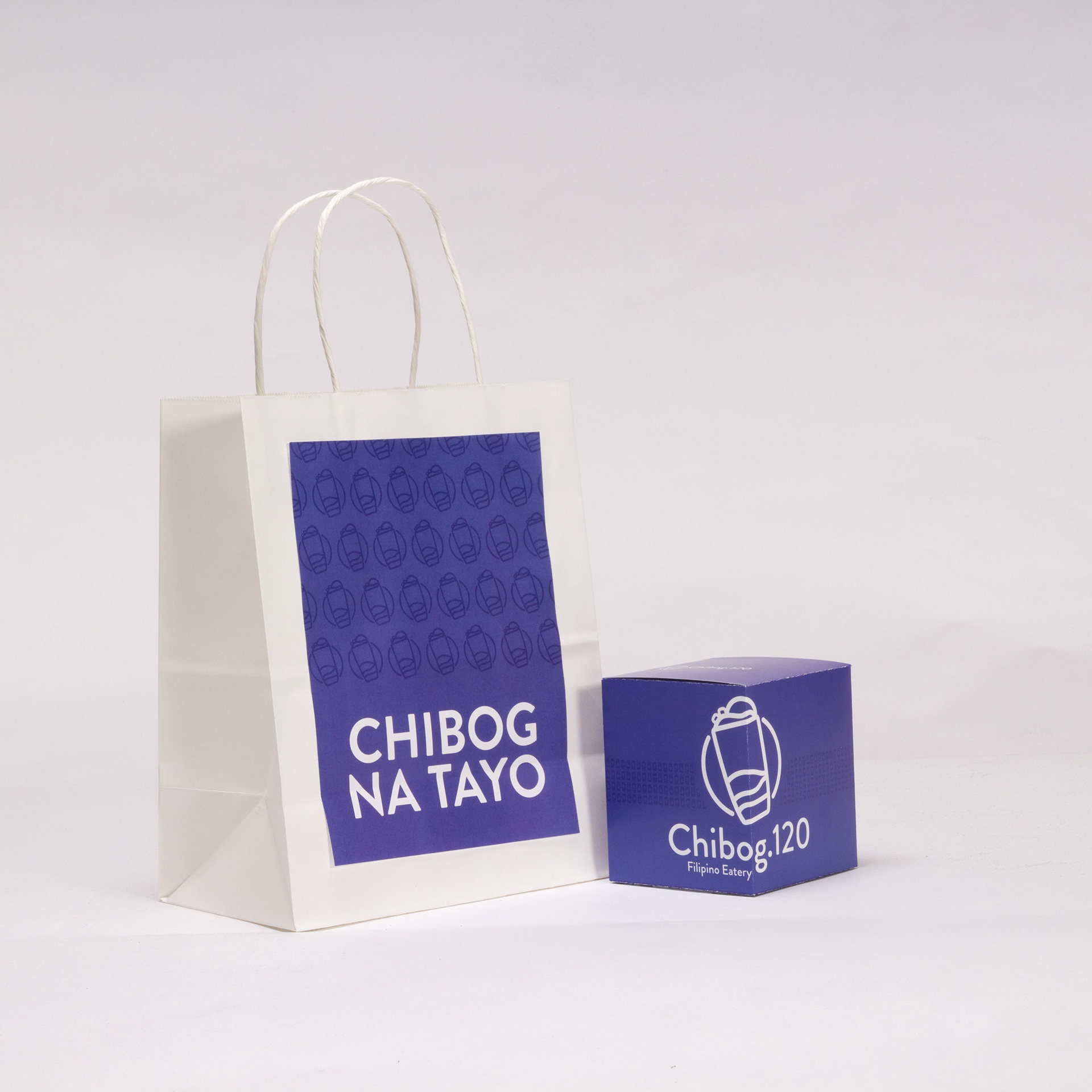
The logo depicts Halo-Halo, a popular Filipino shaved ice delicacy. Because it is the major component behind the business, I decided to make it the logo. Ube, or purple yam, is a popular ingredient in Filipino delicacies and cuisines, and inspired the color scheme.
The packaging is intended for Filipino pastries and other tiny sweets. The phrase "Chibog na tayo" on the takeout bag translates to "Let's all eat".